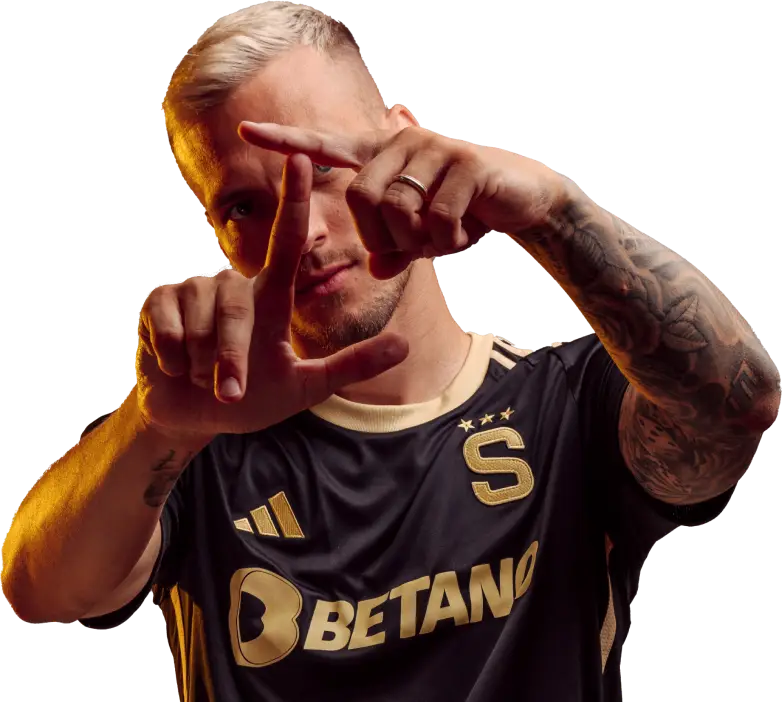
Sparta Forever
What does the phrase "new visual identity" actually mean? The club cared about the unification of the graphics of all projects belonging to ACS, the emphasis was placed on the use of one font style created specially for Sparta. At the same time, the authors of this concept had the highest ambition: to work with the club emblem creatively but, at the same time, with respect for the tradition.
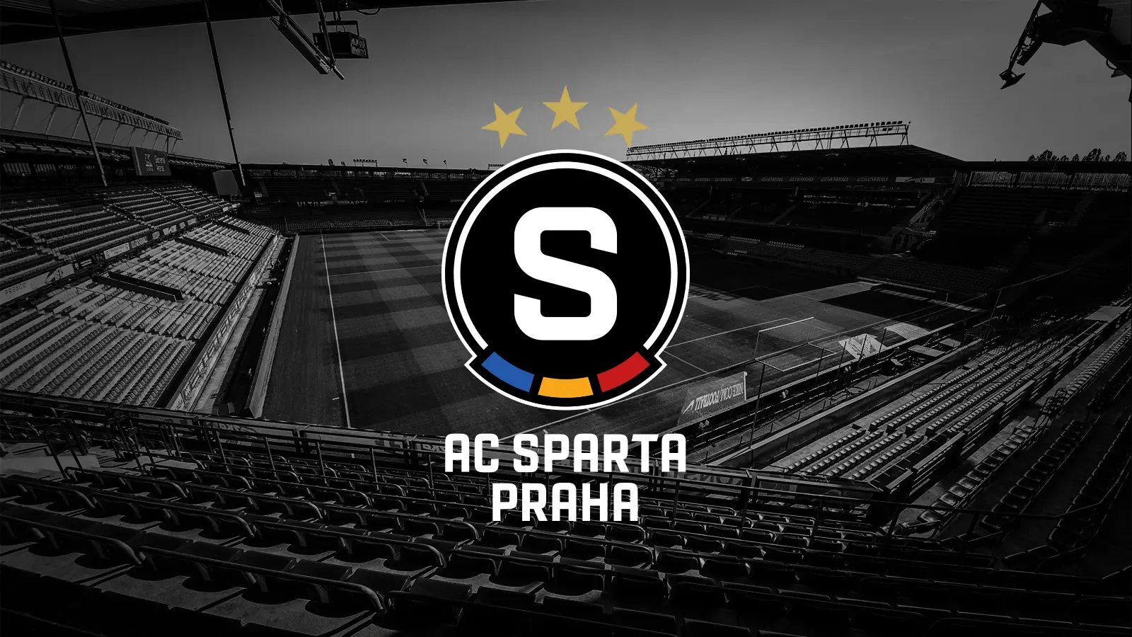
Do you actually know how long the club has used the current logo? The Letná stadium and the jerseys of male and female players from children’s categories to the first team have been decorated for 27 long years with a symbol that will forever be associated mainly with the achievements of the 1990s. That is, with the achievements in the decade when the logo, which was supposed to distinguish football Sparta from other clubs of the same name in the era of the owner Petr Mach, was created.
Of course, we also espouse this logo. Nevertheless, after several years of internal discussions, the belief emerged in the club that it was necessary to begin its evolution. And now you know the result of the cooperation of the club’s representatives with renowned experts in the field of graphic design and sports marketing.
This is the new coat of arms of AC Sparta Praha for the 21st century…

…this is the new, unique font of ACS…

…and here you can see the unified graphics of individual Sparta projects:

As regards the visual style, it was important for us that it should look self-confident and distinctive. That is why we bet on striking typography and a combination of two Sparta‘s colours – black and red.
You can find much more information about the change of the visual identity on the special website Navzdy Sparta.cz.
"The direction that we have chosen after long discussions represents a natural development and moves us graphically from the past to the present. We try to respect modern trends, yet in our opinion this is not a hurried revolution. That is why we believe that the result will be close to the fans‘ hearts. Although we know that our supporters will discuss this step a lot. But we don’t mind that at all," says František Čupr, CEO of AC Sparta Praha, about the change of Sparta’s visual identity.
"The club’s marketing needs, expectations from our fans and requirements for the use of the club identity on the part of Sparta’s business partners have changed significantly during the time I have been working (with a break) in the club," adds Tomáš Křivda, Director of Commercial Activities of ACS and Member of the Board. He was part of a team that dealt with a potential graphic change before leaving the club temporarily in 2017. After returning to Sparta in the autumn of 2020, he became part of the project team.
"In order to create the new identity, we contacted the industry leaders. For example, we collaborated with Alan Záruba, a graphic designer who, as a professional consultant, supervised the artistic quality of the entire project. We were not under any time pressure, it was necessary to thoroughly discuss each step. We realized all the time how important a project we had in our hands," explains Kamil Veselý, Marketing Director of ACS.
The visual concept was created for the club, after winning the selection procedure, by the Go4Gold agency, which cooperated, for example, with hockey Sparta or the Czech Ice Hockey Association in the past. "When creating the logo, the intention was to preserve the key elements that have defined Sparta for more than one hundred years, and to create a clear and distinctive mark following the unique history of the club applied to the 21st century," emphasizes Tadeáš Drahorád, Art Director of Go4Gold.
The club presents the new identity in advance, because it is currently necessary to work on changes in the stadium, on the preparation of new jerseys and on the production of Sparta‘s souvenirs. And during these preparations, it was no longer appropriate to keep these changes secret. Nevertheless, the current season will continue to be accompanied by the current concept, the new graphic symbols of ACS will really be part of the club identity from the 2021/2022 competition season.